13 Dorm Bed Inspo Y2K Retro Colorful Bold Twin XL Style
The Y2K aesthetic rejects nearly everything the soft pastel dorm bed stands for, and that rejection is precisely the point. Where pastel styling whispers in desaturated, low-contrast tones, Y2K retro bedding shouts in saturated primary and neon brights, clashing patterns deployed on purpose, and a specific early-2000s visual vocabulary — butterflies, flames, smiley faces, checkerboard, lightning bolts, bubble letters — that signals a very particular cultural moment rather than a generic mood. This is bedding built for someone who wants their dorm bed to look like it belongs in a Bratz commercial or a Lisa Frank notebook, not someone chasing quiet luxury.
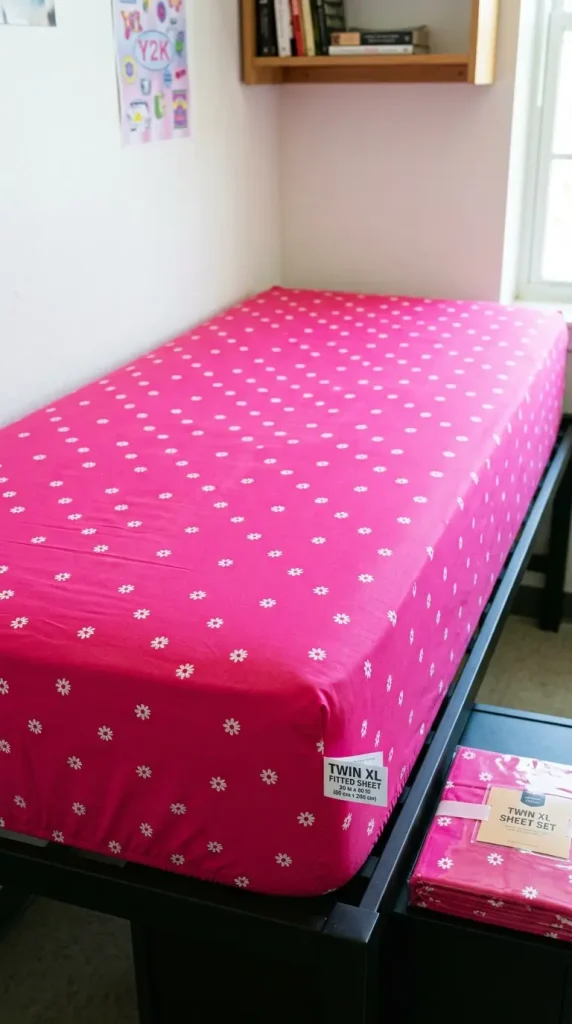
The Twin XL sizing constraint still applies with exactly the same urgency here as in any other bedding style, because a saturated hot pink fitted sheet that bunches and slides off a Twin XL mattress corner looks just as sloppy as a beige one would, and the entire Y2K effect depends on bold pattern and color sitting flat and confidently across the full bed rather than fighting against an ill-fitting base layer. Confirming Twin XL dimensions before buying remains the unglamorous first step beneath every loud color choice that follows.
The styling principle that governs successful Y2K bedding is deliberate maximalism rather than accidental clutter: multiple bold patterns and colors are meant to coexist on the same bed, but they coexist on purpose, using a specific set of period-accurate motifs and a saturated color family — hot pink, electric blue, lime green, bright orange, sunshine yellow — repeated across different textures and patterns so the overall effect reads as a curated explosion rather than a random pile of mismatched throw pillows. The bed is allowed, and even expected, to compete visually with everything else in the room, because that loudness is the entire aesthetic’s reason for existing.
These 13 ideas cover every dimension of the Y2K retro Twin XL bed — from the foundational color and pattern combinations to the specific motif throws, fuzzy textures, character collaborations, and lighting choices, and the complete maximalist bed where every clashing pattern and every saturated color works together as one unapologetically loud, completely personal, thoroughly 2000s sleep space.
1. Getting the Twin XL Sizing Right Before Going Bold
Loud color and bold pattern only read as confident styling when the bedding beneath them actually fits, and a Twin XL mattress demands the same sizing diligence here as in any quieter aesthetic — checking package labeling specifically for “Twin XL” or “39 by 80 inches” rather than assuming standard “Twin” sizing will work. A vivid hot pink fitted sheet that pulls loose at the corners and exposes a bare mattress edge undercuts the entire maximalist effect just as badly as a sloppy fit would undercut a minimal one, because Y2K boldness depends on every pattern sitting flat, taut, and fully committed across the whole bed rather than sliding or bunching against the frame.
2. Hot Pink and Electric Blue as the Foundational Color Clash
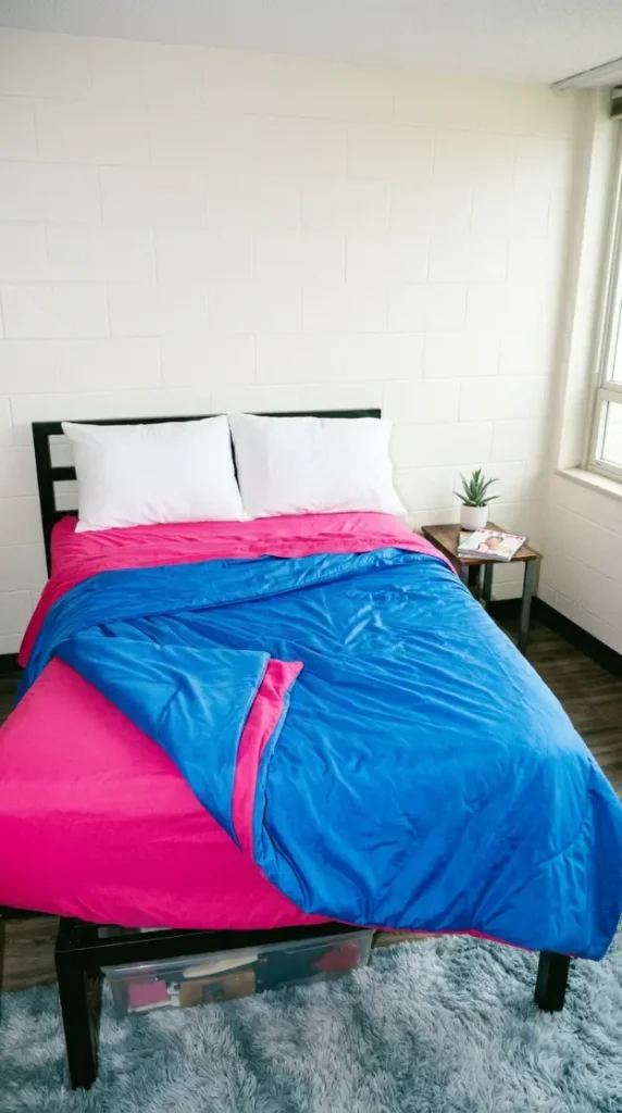
Hot pink and electric blue sit at near-opposite points on the color wheel, and placing them directly against each other rather than separating them with a neutral buffer is the single decision that announces a bed is Y2K rather than simply colorful. A hot pink fitted sheet beneath an electric blue duvet, or the reverse, creates the kind of high-contrast, slightly aggressive color pairing that defined early-2000s teen bedrooms, mall culture, and television set design, and the pairing works precisely because it refuses the safer, more tasteful approach of choosing colors that flatter each other, opting instead for colors that visually compete and somehow look better for the friction.
3. Butterfly Motif as the Defining Y2K Print
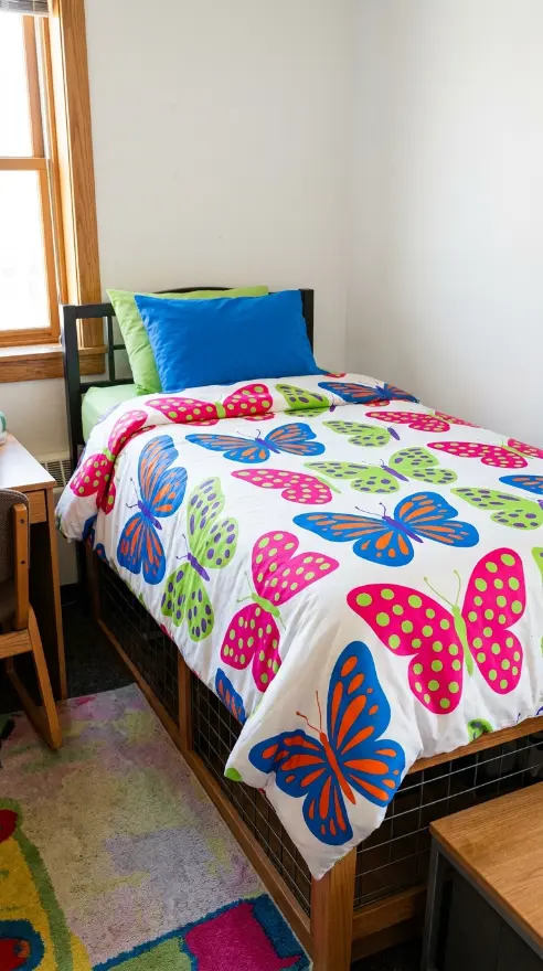
No single image is more immediately and more specifically associated with early-2000s girl culture than the butterfly, and a large-scale butterfly print — across a duvet cover, a set of pillowcases, or a wall decal cluster above the headboard — functions as the single most period-accurate visual signal available in this entire aesthetic. The print works best oversized and repeated rather than small and scattered, with butterflies rendered in flat, saturated color blocks — hot pink wings with lime green spots, electric blue wings with orange detailing — rather than any naturalistic, muted, or watercolor treatment that would soften the print into something closer to a botanical illustration than a Y2K motif.
4. Checkerboard Pattern as a Graphic Border Detail
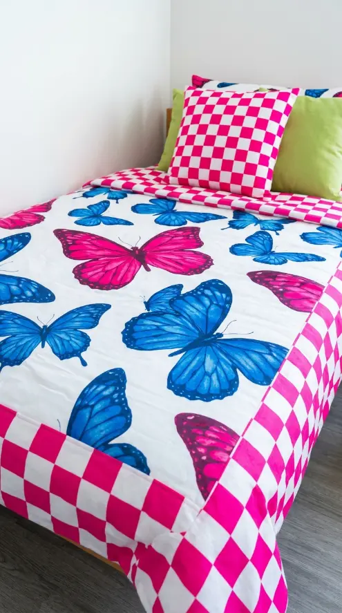
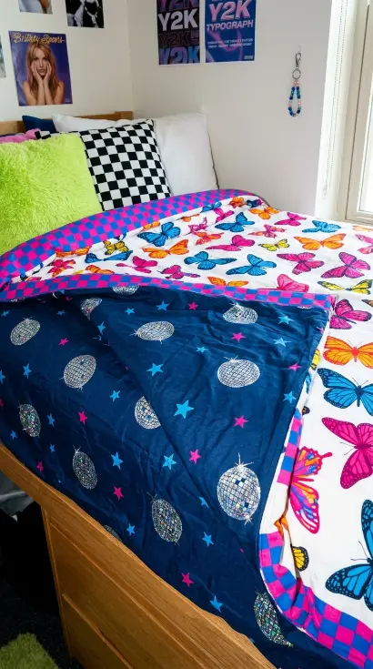
A checkerboard pattern, in orange and black, hot pink and white, or lime green and electric blue, deployed as a border trim along the edge of a duvet or as a single accent pillow rather than across an entire textile, introduces a strong graphic geometric note that contrasts sharply against the organic curves of a butterfly print elsewhere on the bed. Checkerboard carries its own distinct skate-and-mall-culture association within the broader Y2K aesthetic, slightly more masculine-coded and slightly more graphic than the softer butterfly and daisy motifs, and pairing the two patterns on the same bed — checkerboard border against butterfly field — demonstrates the deliberate maximalist principle of combining multiple period-specific motifs rather than committing to only one.
5. Fuzzy Faux Fur Throw in a Saturated Neon Tone
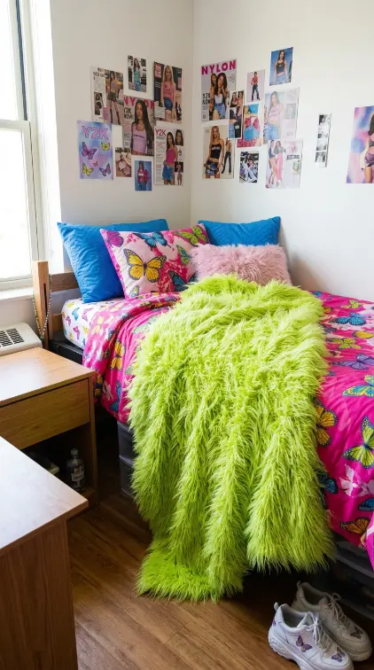
Where the pastel aesthetic uses faux fur sparingly in pale, muted tones, the Y2K bed claims fuzzy texture as a primary feature rather than a quiet accent, and a full-size faux fur throw blanket in a fully saturated neon tone — lime green, hot pink, or electric blue — draped across the entire foot of the bed becomes one of the loudest and most tactile statements in the whole composition. The exaggerated long pile of a Y2K-appropriate faux fur, longer and shaggier than the shorter, more refined pile used in quieter aesthetics, reads as deliberately over-the-top, referencing the specific fuzzy phone cases, fuzzy pens, and fuzzy backpack accessories that defined the era’s relationship to texture as another form of personal decoration.
6. Tie-Dye Bolster Pillow for Retro Color Blending
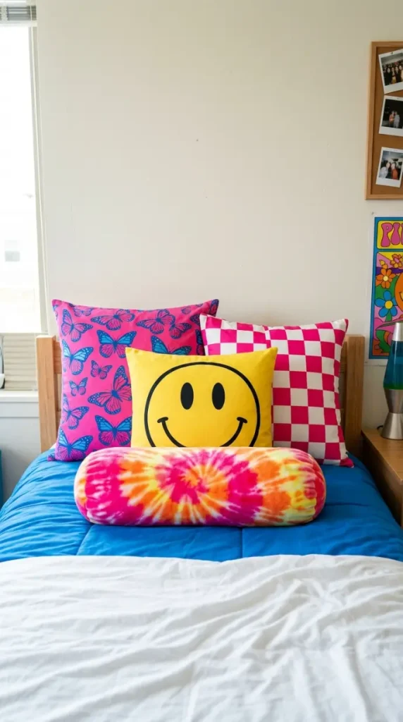
A round bolster pillow rendered in a hot pink, orange, and yellow tie-dye pattern brings a third distinct print technique onto the bed alongside the flat graphic butterflies and the crisp checkerboard, and its swirling, hand-dyed-looking color blend reads as a direct callback to the tie-dye revival that ran parallel to the broader Y2K moment. Positioned lying horizontally in front of the standing pillows, the bolster’s cylindrical shape breaks up the otherwise rectangular pillow lineup while its blended, smudged color transitions — rather than the hard graphic edges of the checkerboard or the flat color blocks of the butterflies — give the eye one moment of softer, more chaotic pattern blending within an otherwise crisply patterned bed.

7. Smiley Face Motif as a Playful Graphic Accent
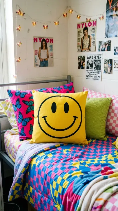
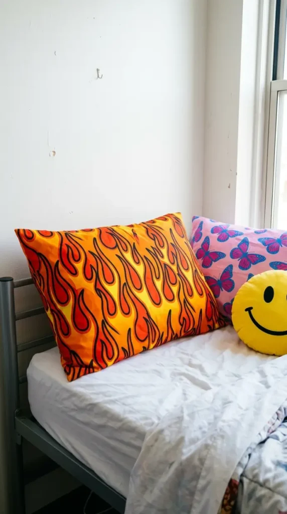
The smiley face, rendered in its simplest possible form — a flat yellow circle with two black oval eyes and a single curved black line for a mouth — carries a specific Y2K-era irony and casual playfulness distinct from the more decorative butterfly or daisy prints, often appearing on a single accent pillow, a small patch sewn onto a pillowcase corner, or scattered in a repeating pattern across a smaller textile like a pillowcase rather than a full duvet. The motif’s appeal lies in its deliberate simplicity and its slight wink of self-aware humor, functioning less as a decorative pattern and more as a graphic statement piece that signals the bed’s owner is in on the joke of its own nostalgic loudness.
8. Flame Motif Pillowcase for a Skater-Adjacent Edge
A flame print — stylized orange, red, and yellow flames rendered in the same flat graphic style as the era’s skate decks and racing stripe car decals — introduces a slightly harder, more rebellious edge into the bed’s otherwise sweeter butterfly-and-daisy register, borrowing directly from the skate, moto, and pinstripe visual culture that ran alongside the more conventionally “girly” side of Y2K style. Used on a single pillowcase or as a border print along one edge of a flat sheet, the flame motif works as a deliberate tonal contrast, proof that the bed’s bold maximalism is not limited to one narrow slice of 2000s nostalgia but pulls from multiple corners of the era’s visual culture simultaneously.
9. Lightning Bolt Accent Piping for a Graphic Edge Detail
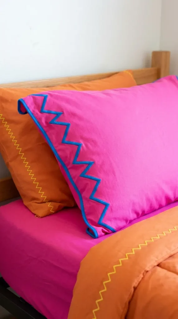
A thin lightning bolt-shaped appliqué or zigzag piped edge, sewn along the seam of a pillowcase or duvet border in a single contrasting bright color — electric blue piping on a hot pink pillow, or yellow zigzag stitching along an orange duvet hem — introduces the same kind of small tailored detail that a scalloped edge provides in a softer aesthetic, but rendered as a sharp angular zigzag rather than a soft curve, keeping the detail consistent with the era’s preference for hard angular graphics over rounded, gentle shapes. This small detail rewards close inspection the same way any finishing touch does, while reinforcing the specific graphic, slightly electric visual language that separates Y2K boldness from any other maximalist color aesthetic.
10. Disco Ball and Star Print Accent Sheet
A disco ball and star print, scattered across a flat sheet or glimpsed beneath a folded-back duvet, introduces a glossy, slightly metallic-looking visual motif that nods to the era’s fascination with Y2K futurism and millennium-countdown imagery running alongside its more bubblegum pop culture references. Small silver and holographic disco balls printed against a deep purple or midnight blue ground, paired with scattered five-pointed stars in electric blue or hot pink, gives the bed one moment of cooler, more metallic-toned pattern that contrasts against the warmer butterfly and flame motifs, while still reading unmistakably as period-specific rather than generic celestial decor.
11. Layered Pillow Heights for Maximalist Dimensional Depth
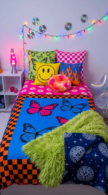
The same stepped pillow arrangement principle that gives a pastel bed dimensional depth applies with equal force to a Y2K bed, but here the height progression also functions as a pattern-reveal sequence: two tall standing pillows at the back in the boldest prints — butterfly and checkerboard — one slightly shorter square pillow in front showing the smiley face or flame motif, and one round tie-dye bolster lying lowest at the very front, ensures every distinct pattern and motif remains simultaneously visible from the front of the bed rather than one loud print obscuring another. This structural arrangement keeps a bed carrying five or six different bold patterns from collapsing into visual noise, because the eye can still trace a clear hierarchy even as it processes maximum pattern density.
12. Y2K Bed Paired With a Lava Lamp and Colorful String Lights
Where the pastel bed relies on warm white fairy lights diffused through sheer fabric, the Y2K bed calls for a louder lighting strategy: multicolor LED string lights in saturated primary colors strung along the headboard wall, paired with a genuine lava lamp on a nearby shelf or nightstand, its slow-moving wax blobs glowing in hot pink or electric blue against a clear or colored liquid base. Together these two light sources contribute a specific quality of constantly shifting, saturated, slightly psychedelic ambient color that flat warm lighting cannot replicate, reinforcing the bed’s maximalist patterns with an equally maximalist lighting atmosphere rather than letting a neutral light wash flatten the saturated colors already established in the bedding.
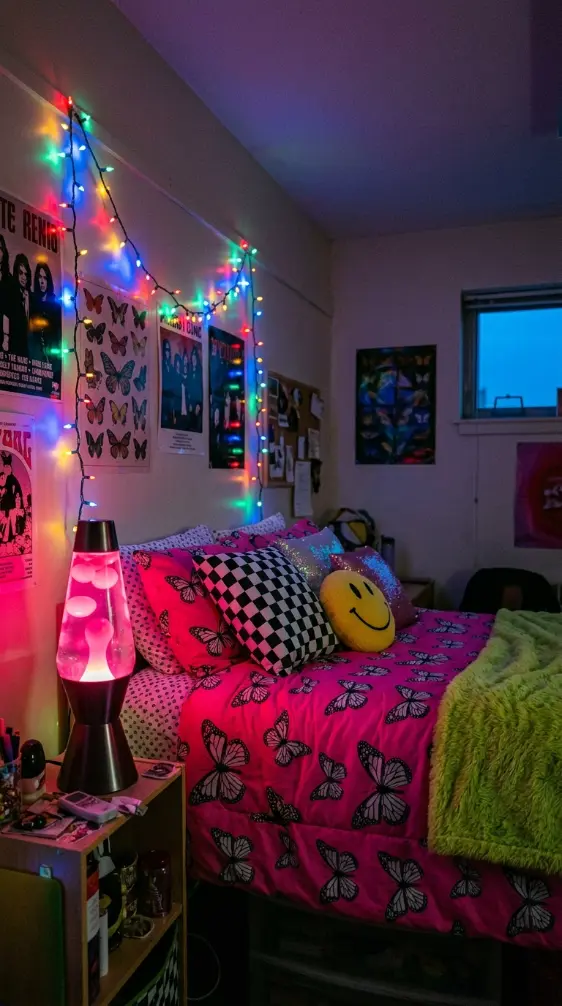
13. The Complete Y2K Retro Twin XL Bed — Every Pattern Together
The complete Y2K Twin XL bed is the fully realized version of every principle in this guide colliding on one frame at once: correctly sized hot pink daisy sheets as the base, an electric blue and orange checkerboard-bordered butterfly print duvet folded back to reveal a disco ball and star print sheet beneath, a stepped pillow arrangement running from tall butterfly and checkerboard pillows at the back through a smiley face square pillow to a tie-dye bolster lying lowest at the front, a shaggy lime green faux fur throw draped diagonally across the foot, a flame print pillowcase and lightning bolt piping adding edge detail throughout, and the entire bed lit by a hot pink lava lamp and a strand of multicolor string lights rather than any neutral overhead fixture. Every saturated color competing on purpose. Every period motif represented. Every print visible rather than buried. The bed that makes clear, the instant anyone walks into the room, exactly which decade it wants to live in.