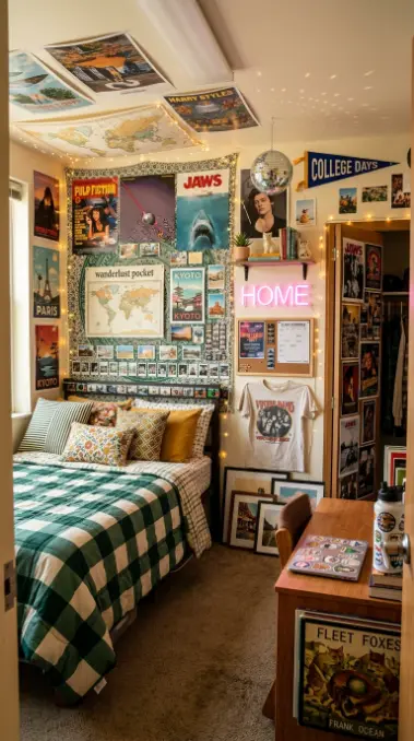
26 Dorm Bed Inspo Maximalist Gallery Wall Twin XL Style
There is a specific kind of creative liberation that happens the moment a college student decides to cover every available inch of their dorm room wall rather than leaving any of it bare — a liberation that runs directly counter to the minimalist instinct many people bring into adulthood, and precisely because of that contrast, the maximalist dorm gallery wall has become one of the most genuinely joyful and most personality-revealing decorating choices available to a first-year student. Where the minimalist approach treats the dorm wall as a canvas requiring restraint, the maximalist gallery wall treats it as exactly what it actually is: the single most temporary, most low-stakes, and most completely controllable creative surface most eighteen-year-olds have ever been handed, and the appropriate response to that freedom is abundance.
The maximalist gallery wall above a Twin XL dorm bed solves a specific spatial problem that minimalist styling does not address as effectively: the dorm bed’s headboard wall is, in nearly every standard dorm configuration, the single largest uninterrupted flat surface in the entire room, frequently three to four feet wide by six to seven feet tall, and a maximalist approach uses every centimetre of that surface as an opportunity rather than treating it as empty space to be calmly ignored. Movie posters layered beside band prints layered beside polaroid photo strips layered beside string lights layered beside a tapestry corner peeking out from underneath everything else — the wall becomes a dense, personally curated collage that tells the story of exactly who this specific student is, assembled from the actual posters and photos and ticket stubs and prints they have collected rather than a single coordinated purchased aesthetic.
The Twin XL bed itself — six inches longer than a standard twin, the specific dimension nearly every American dorm room is built around — becomes the grounding anchor beneath this visual abundance, its bedding typically kept slightly simpler in pattern complexity than the wall above (though by no means restrained in color) specifically so the wall’s density has room to be the room’s primary visual event. The relationship between an intensely layered gallery wall and a bed dressed in one or two bold but legible patterns, rather than the bed itself also competing for maximum visual density, is the specific compositional logic that makes the maximalist dorm bedroom read as confidently curated rather than simply chaotic.
These 26 ideas show every dimension of the dorm bed maximalist gallery wall Twin XL aesthetic — from the foundational grid layout method to the complete dorm room reveal where every poster, every string light, every photo strip, and every layered tapestry corner above the Twin XL bed creates one unified vision of the most personality-packed, most genuinely joyful, and most thoroughly maximalist dorm bedroom imaginable.
1. The Grid Layout Foundation — Even-Spaced Poster Method
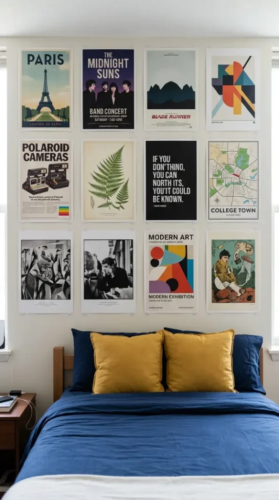
The most foundational and most beginner-accessible maximalist gallery wall method uses a strict grid layout — posters and prints of identical or near-identical size arranged in perfectly even rows and columns with consistent spacing between each piece — which paradoxically allows for genuine visual abundance while remaining easy to plan and execute without any design experience. The grid foundation: nine or twelve posters of the same standard size (typically 11 by 17 inches) arranged in a perfectly even three-by-three or three-by-four grid above the Twin XL bed, each poster spaced exactly 5cm from its neighbors on every side, the rigid mathematical structure itself creating a satisfying visual order even as the individual poster content remains wildly varied and personal.
2. The Salon-Style Organic Cluster — Asymmetric Abundance Method
In direct contrast to the grid method, the salon-style organic cluster arrangement embraces deliberate asymmetry — posters and prints of wildly varying sizes hung at slightly different heights and angles, some overlapping at their edges, with no consistent spacing or alignment logic — recreating the dense, personally evolved wall arrangements found in European salon-style picture hanging traditions, here applied to band posters and movie prints rather than oil paintings. The salon cluster: twenty or more prints in varying sizes from small 8 by 10 inch prints to large 24 by 36 inch posters, arranged with intentional asymmetry so that some pieces hang higher, some lower, some prints slightly overlapping the edges of their neighbors, creating an organically dense composition that looks as though it accumulated naturally over years.

3. The Vintage Movie Poster Wall — Cinematic Collection Theme
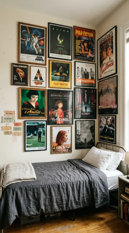
A gallery wall built entirely around vintage and reproduction movie posters — spanning multiple decades and genres from 1970s sci-fi to 1990s cult classics to contemporary A24 indie films — creates a thematically unified but visually maximalist collection that reveals genuine personal taste through curation rather than relying on visual randomness alone. The movie poster wall: fifteen to eighteen film posters of varying sizes and original release decades, arranged in the salon-cluster style, the unifying thread being cinema itself rather than any single visual color palette, creating a wall that functions simultaneously as decoration and as a genuine conversation-starting film collection.
4. The Band and Concert Poster Music Wall — Sonic Identity Display
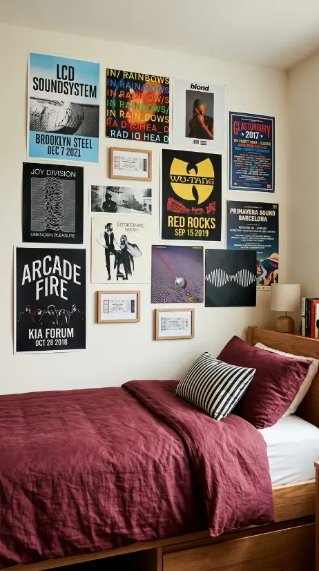
A gallery wall assembled from band posters, concert flyers, and album cover reproductions — spanning the student’s actual musical taste from a high school concert ticket stub to a favorite album’s iconic cover art enlarged to poster size — creates a wall that functions as a direct visual representation of personal musical identity. The music wall: twelve to fifteen pieces including actual collected concert posters from shows attended, several album cover art reproductions printed at poster scale, a few band logo prints, and one or two genuine ticket stubs framed in small simple frames among the larger unframed posters, the collection spanning multiple genres reflecting genuinely eclectic taste.
5. The Polaroid and Photo Strip Memory Cluster — Personal Documentary Layer
Woven throughout or clustered within sections of the larger poster gallery wall, an abundance of actual personal photographs — polaroid-format prints with their characteristic white borders, photo booth strips with their vertical sequence of four small images, and disposable camera prints with their slightly imperfect candid quality — adds the specifically personal documentary layer that distinguishes a genuinely autobiographical maximalist wall from one built purely from purchased posters. The photo memory cluster: thirty or more polaroid-style prints and six or seven photo booth strips distributed throughout the larger gallery wall composition, each photograph showing actual friends, family, and college memories, creating small dense pockets of personal documentation interspersed among the larger purchased posters.
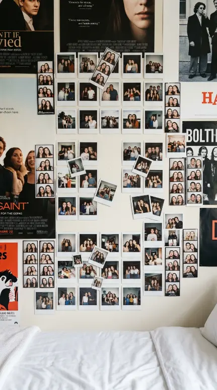
6. The Layered String Light Weave — Multi-Height Ambient Pattern
Rather than a single string of lights draped once across the gallery wall’s top edge, weaving two or three separate strands of warm white string lights at different heights through and across the poster layers — one strand near the ceiling, one woven horizontally through the wall’s middle section, one draped loosely at the bottom edge near the headboard — creates a more architecturally integrated and more genuinely dimensional lighting pattern than a single simple light strand. The multi-height weave: three separate warm white string light strands, each approximately 5 meters long, installed at three different heights across the gallery wall using small clear adhesive clips, creating a layered lighting pattern that illuminates different sections of the dense poster collection from different angles.
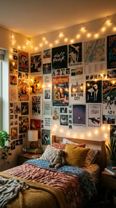
7. The Tapestry Anchor with Poster Overlay — Mixed Media Foundation
Using a single large tapestry as the gallery wall’s foundational base layer — covering the full width and most of the height of the wall above the bed — and then layering smaller posters and prints directly on top of sections of the tapestry, creates a mixed-media depth effect where the tapestry functions as both decoration in its own right and as a textured backdrop visible peeking out between and around the poster layer above it. The tapestry foundation: one large tapestry approximately 1.5 by 2 meters in a bold mandala or geometric pattern, mounted flat against the wall as the base layer, with eight to ten smaller posters and prints mounted directly over portions of the tapestry, allowing the tapestry’s pattern to remain visible in the gaps between and around the overlaid posters.

8. The Color-Themed Maximalist Wall — Monochromatic Abundance Strategy
Rather than allowing poster colors to vary completely randomly, a deliberate color-themed maximalist wall selects every poster, print, and photo specifically within one dominant color family — all reds and pinks, or all blues and teals — creating a wall that achieves genuine visual abundance and density while maintaining enough color discipline to read as intentionally curated rather than chaotic. The color-themed wall: eighteen posters and prints all selected specifically for their dominant red, pink, or burgundy color content (a red film poster, a pink album cover, a burgundy abstract print, a red neon sign image), the strict color discipline allowing maximum density without the visual fatigue that fully randomized rainbow color combinations can produce.
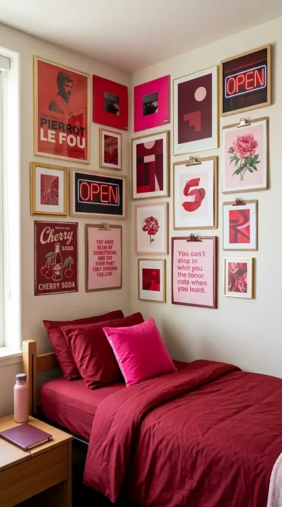
9. The Neon Sign and LED Word Art Accent — Illuminated Typography Statement
A small battery or USB-powered LED neon-style sign — spelling a single word, a short phrase, or simply a shape like a star or heart — mounted as a focal accent within or above the larger poster gallery wall, brings a specifically illuminated typography element that adds genuine light-emitting dimension beyond the warm glow of standard string lights. The neon accent: one LED neon-style sign approximately 30cm wide, spelling a short personal word or phrase in a flowing script font, mounted at a slight angle overlapping the top edge of several posters, its colored glow (pink, blue, or warm white) creating a small but genuinely distinct illuminated focal point within the broader poster composition.
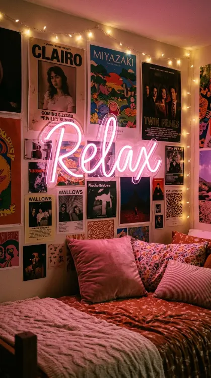
10. The Disposable Camera Print Strip Border — Candid Imperfection Frame
A continuous horizontal or vertical strip of small disposable camera prints — their characteristically slightly grainy, occasionally off-center, candid quality distinct from both polished digital photography and the instant-format polaroid — arranged in a continuous border or strip along one edge of the larger gallery wall composition, adds a specifically nostalgic and intentionally imperfect photographic texture that has become particularly associated with the current generation’s specific aesthetic revival of disposable film cameras. The disposable print border: eighteen to twenty small disposable camera prints, each approximately 10cm by 15cm, arranged in a continuous horizontal strip along the bottom edge of the gallery wall just above the headboard, the prints’ candid, sometimes blurry, sometimes flash-overexposed quality creating a deliberately imperfect documentary border beneath the more polished posters above.
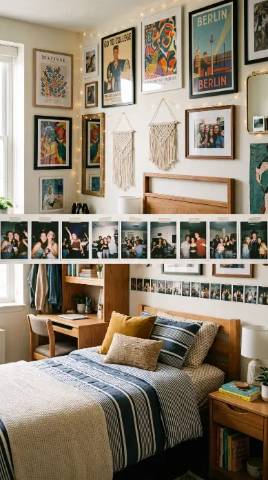
11. The Removable Mounting Method Education — Dorm-Safe Hanging Technique
Understanding and correctly applying the specific removable mounting products that allow a maximalist gallery wall of this density to be installed without violating dorm no-damage policies — different adhesive strip weight ratings for different poster sizes, gel-based reusable adhesive for repositioning during the planning phase, and specific removal techniques that prevent paint damage — represents the essential practical knowledge underlying the entire maximalist wall concept’s feasibility within dorm housing rules. The mounting method education: a close demonstration showing three different removable mounting products in use — lightweight adhesive strips for small prints, heavier-duty foam mounting squares for larger posters, and a reusable adhesive putty for the tapestry’s corners — each rated appropriately for the weight and size of poster it is supporting.
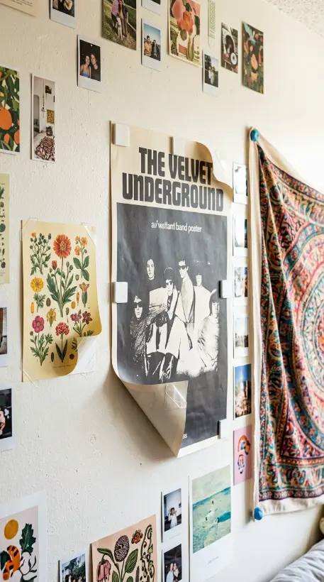
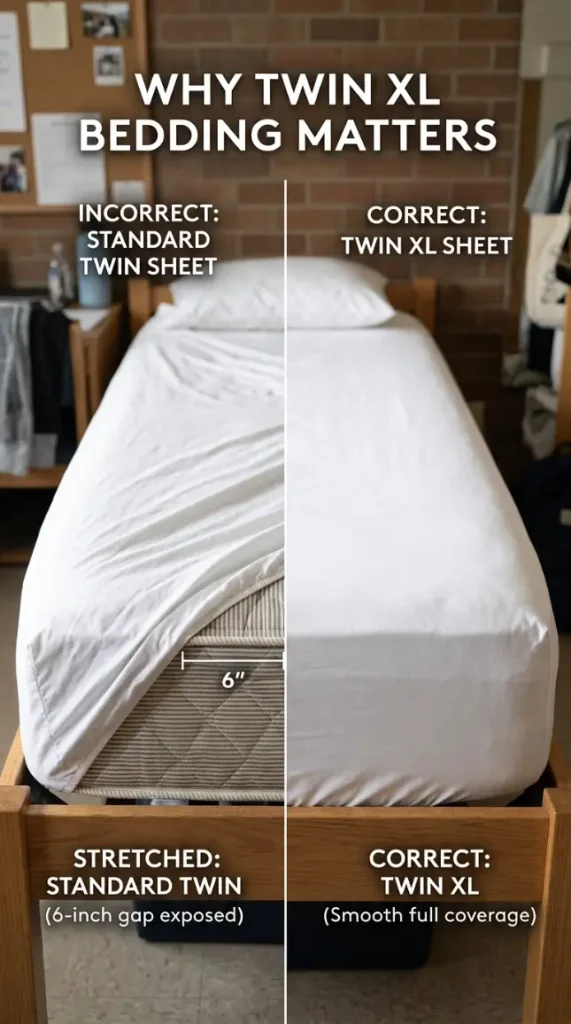
12. The Twin XL Specific Bedding Fit Correction — Sizing Knowledge Detail
Understanding that Twin XL bedding (designed specifically for the 39 by 80 inch dorm mattress, six inches longer than a standard residential twin) requires its own correctly sized sheets and comforters rather than substituting standard twin bedding that will leave the mattress’s extra length completely exposed and unmade, represents essential practical knowledge for achieving a genuinely well-fitted and visually complete bed beneath the maximalist wall above. The sizing correction detail: a close comparison showing the visible gap and exposed mattress that results from using incorrectly sized standard twin sheets on a Twin XL mattress, contrasted against the same mattress properly fitted with correctly sized Twin XL sheets that cover the full extended length without any gap or pulled-tight strain.
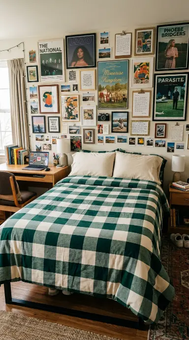
13. The Bold Pattern Comforter Anchor — Single Strong Print Strategy
Rather than choosing a comforter with a busy all-over print that might visually compete with the dense gallery wall above, selecting one single bold but graphically simple pattern — a large-scale buffalo check, a wide-stripe pattern, or a single oversized geometric motif — creates the most successful bedding foundation beneath maximalist wall styling, the bed’s strong but legible single pattern providing grounding without adding visual noise that competes with the wall’s already dense complexity. The bold pattern anchor: a comforter in a large-scale plaid or wide horizontal stripe pattern using only two or three colors, the pattern’s scale large enough to read clearly from across the room, providing the bed with its own confident visual identity that complements rather than competes with the gallery wall’s intricate density above.
14. The Closet Door Interior Gallery Extension — Hidden Wall Continuation
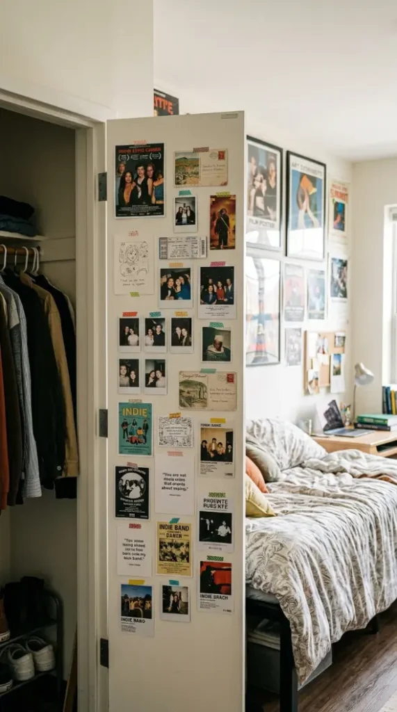
Extending the gallery wall concept onto the inside of the dorm closet door — a surface frequently overlooked and left bare even in otherwise heavily decorated dorm rooms — using the same removable mounting methods to continue the poster and photo collection onto this additional available surface, demonstrates genuine maximalist commitment by recognizing that closet door interiors represent meaningful additional real estate for visual density. The closet door extension: the closet door’s interior face covered with eight to ten additional smaller posters and photos, mounted with the same removable adhesive strips used on the main wall, creating a secondary gallery moment that is revealed and concealed simply by opening and closing the closet, adding an element of discovery to the room’s overall visual abundance.
15. The Ceiling Treatment Extension — Vertical Wall-to-Ceiling Continuity
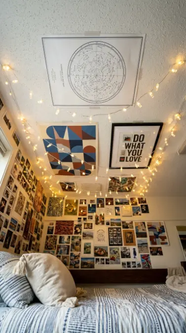
For dorm rooms with the appropriate ceiling height and configuration, extending the gallery wall concept onto the ceiling directly above the bed — fairy lights arranged in a canopy pattern, a few flat posters mounted overhead, or simply a single large fabric panel — creates the most architecturally complete possible version of the maximalist treatment, the visual density continuing through the room’s full available surface area rather than stopping abruptly at the point where wall meets ceiling. The ceiling extension: a section of the ceiling directly above the bed treated with a combination of three flat posters mounted overhead (using lightweight adhesive appropriate for ceiling application) and a draped fairy light canopy woven between them, creating genuine wall-to-ceiling visual continuity for anyone lying in the bed looking directly upward.
16. The Roommate Shared Wall Negotiation — Adjacent Style Coexistence
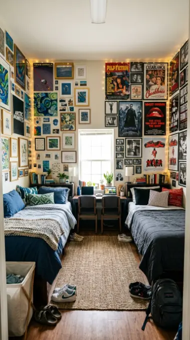
In a shared double dorm room, two roommates each building their own distinct maximalist gallery wall above their respective beds — different poster collections, different color themes, potentially different levels of density — coexisting successfully on adjacent or facing walls within the same room, demonstrates the practical reality that maximalist personal expression and genuine roommate coexistence are achievable simultaneously through simple spatial division rather than requiring matched or coordinated aesthetics. The shared wall negotiation: two distinct gallery walls visible within the same room, one roommate’s wall built around a bold color-themed collection in blues and greens, the other roommate’s wall built around vintage movie posters in a more neutral palette, both equally dense and maximalist in their own right but completely independent in content and color, separated simply by the room’s natural spatial division between the two beds.
17. The Vintage Concert Tee and Textile Wall Hanging — Fabric Display Layer
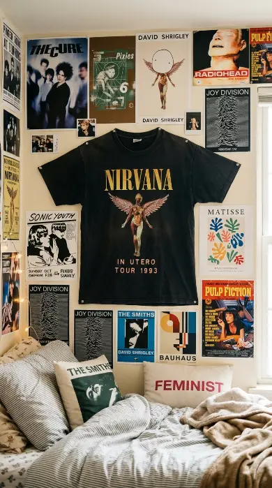
Mounting an actual band t-shirt or vintage graphic tee flat against the wall — stretched slightly on a simple frame or pinned at the shoulders and hem to lie flat — as one element within the larger gallery wall composition, brings genuine wearable textile into the wall’s visual vocabulary alongside printed posters and photographs, the shirt’s specific graphic design and worn, slightly faded fabric quality adding a tactile dimension distinct from flat paper prints. The displayed t-shirt: one vintage band or graphic t-shirt, its fabric pinned flat against the wall at four points (shoulders and hem corners) so the design displays clearly, positioned among the surrounding posters as a textile accent that introduces genuine fabric texture into the predominantly paper-based gallery wall.
18. The Sticker-Covered Laptop and Water Bottle Extension — Personal Object Density
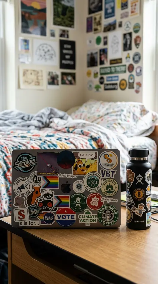
Extending the maximalist density principle beyond the wall itself onto the student’s personal daily-use objects — a laptop lid covered edge to edge in stickers, a reusable water bottle similarly layered with stickers from concerts, clubs, and causes — demonstrates that the maximalist aesthetic philosophy extends as a genuine personal habit rather than remaining confined to one wall-specific decorating project. The personal object density: a laptop with its entire lid surface covered in thirty or more stickers of varying sizes (band logos, meme references, political and social cause stickers, university club logos), positioned on the desk near the bed, alongside a metal water bottle similarly covered in fifteen to twenty stickers, both objects extending the same dense collected-over-time visual philosophy governing the wall above.
19. The Layered Throw Pillow Pattern Mix — Controlled Bed-Level Maximalism
While the comforter itself benefits from single bold pattern restraint, introducing genuine pattern mixing at the smaller scale of the throw pillows — three or four pillows each in a different but color-coordinated pattern (one stripe, one small floral, one geometric, one solid) — allows a controlled degree of maximalist pattern layering directly on the bed without overwhelming the larger comforter’s grounding simplicity. The pillow pattern mix: four pillows, each in a genuinely different pattern type but all sharing the same two or three colors from the comforter’s palette, demonstrating how pattern variety and color discipline can combine to create bed-level visual interest that complements rather than competes with both the comforter below and the gallery wall above.

20. The Vintage Map and Travel Poster Wanderlust Section — Geographic Theme Pocket
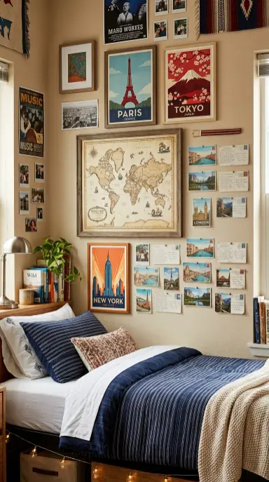
Within the larger gallery wall, dedicating one distinct section specifically to vintage maps, travel posters, and geographic prints — a large reproduction of an antique world map, several vintage-style city travel posters, and a small cluster of actual postcards from places visited — creates a thematically coherent pocket within the broader wall that tells a specific story about travel aspiration or actual travel history. The wanderlust section: one large vintage-style world map poster as the section’s anchor, four smaller city-specific travel posters (Paris, Tokyo, New York, a hometown or study-abroad destination) arranged around it, and six actual postcards collected from real travels pinned in a small cluster at the section’s edge, this geographic theme occupying roughly one quarter of the larger wall’s total area.
21. The Bulletin Board Integration Within the Poster Wall — Functional Display Pocket
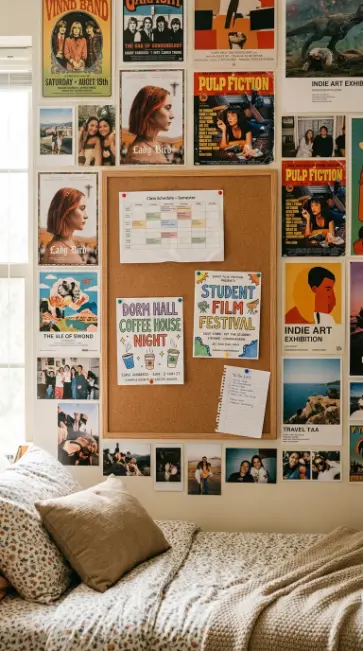
Mounting an actual cork bulletin board directly within the larger poster gallery wall composition — sized and positioned as though it were simply one more rectangular element in the overall arrangement — allows genuinely functional rotating content (class schedules, event flyers, to-do lists) to coexist within the permanent decorative collection, the bulletin board’s content changing throughout the semester while the surrounding posters remain fixed. The bulletin board integration: one cork bulletin board approximately 60cm by 45cm mounted within the gallery wall’s overall layout, its cork surface currently pinned with a class schedule printout, two event flyers, and a small handwritten to-do list, the functional board surrounded on all sides by the permanent poster and photo collection, visually integrated as one more rectangular element within the wall’s overall composition rather than standing apart as an obviously different category of object.
22. The Floor-Level Floating Frame Lean Cluster — Ground-Up Density Extension
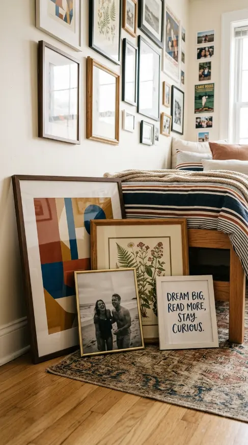
Extending the gallery wall’s visual density down to floor level by leaning several framed prints or posters against the wall directly on the floor beside the bed (rather than mounting every single piece on the wall itself) creates additional visual layers at a different depth and height, the leaned frames’ slight forward tilt and their position partially in front of the wall-mounted collection above adding genuine spatial depth to the room’s overall maximalist composition. The floor lean cluster: four framed prints of varying sizes, leaned against the wall directly on the floor at the foot of the bed or beside the desk, their slight forward tilt and the visible gap of floor space between their base and the wall creating a sense of casual, recently-acquired display distinct from the more permanently mounted wall collection above.
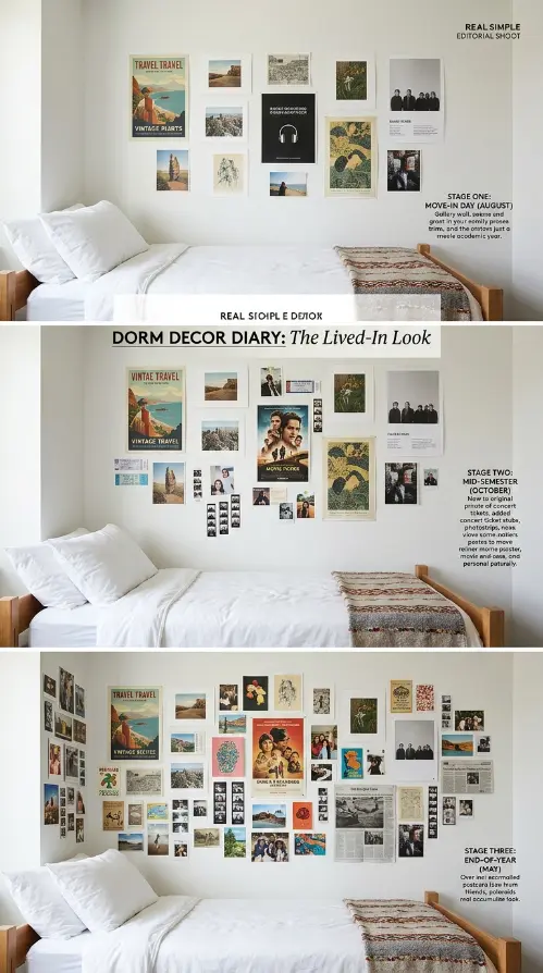
23. The Seasonal Wall Rotation Strategy — Evolving Density Over the Academic Year
Approaching the maximalist gallery wall not as a single fixed installation completed at move-in but as an evolving collection that grows, shifts, and is partially rotated throughout the academic year — adding new posters from concerts attended, swapping out a few pieces seasonally, adding more photo strips as new memories accumulate — demonstrates that genuine maximalist density is best achieved through accumulation over real time rather than through a single complete purchase and installation at the semester’s start. The rotation strategy: a documented progression showing the same gallery wall at three different points in the academic year — move-in day with a moderate twelve-poster foundation, mid-semester with twenty pieces after a few concerts and events, and end-of-year with thirty-plus pieces representing a full year’s genuine accumulated collection.
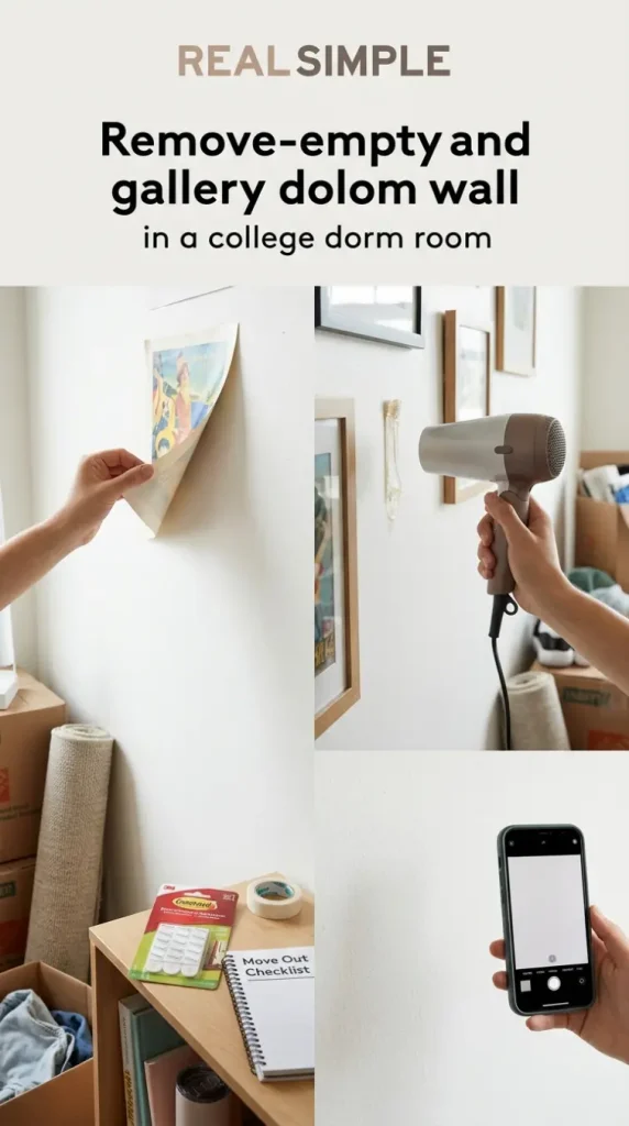
24. The Damage Deposit Protection Documentation — End-of-Year Removal Strategy
Properly documenting the gallery wall’s condition before move-out and following the correct removal sequence for each type of adhesive mounting product used throughout the year — testing removal on a small inconspicuous section first, using a hair dryer’s gentle heat to soften stubborn adhesive residue, and photographing the wall both fully decorated and after removal — protects the student’s housing damage deposit while allowing the full maximalist density to be enjoyed without removal anxiety throughout the year. The removal documentation: a sequence showing the proper end-of-year process — a test removal on one small corner poster revealing clean wall beneath, a hair dryer being used to gently warm and loosen a stubborn adhesive strip, and a final photograph of the completely bare, undamaged wall confirming successful removal of all thirty-plus pieces without any paint damage or residue.
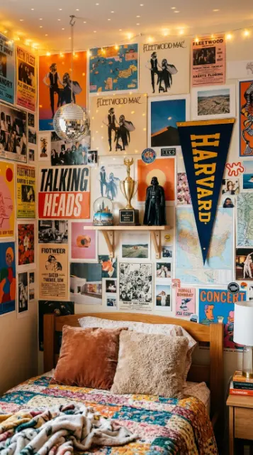
25. The Three-Dimensional Object Integration — Beyond Flat Posters
Adding small three-dimensional objects directly onto the gallery wall composition — a small wall-mounted shelf holding a few collected trinkets, a pennant flag with its slight dimensional fabric drape, a small disco ball or hanging ornament suspended from a hook within the poster cluster — introduces genuine sculptural depth beyond what flat printed posters alone can achieve, these dimensional objects creating shadow and physical presence that adds another layer of visual richness to the wall’s overall density. The dimensional integration: one small floating shelf mounted within the poster collection holding three small collected objects (a snow globe, a small trophy, a vintage toy), one felt pennant flag hung at a slight angle among the surrounding flat posters, and one small disco ball suspended from a hook, its mirrored surface catching and scattering the nearby string lights.
26. The Complete Maximalist Twin XL Dorm Room Reveal — Every Element Together
The fully realized college dorm bedroom in maximalist gallery wall Twin XL style where every element — the dense salon-cluster poster collection with its color theming and thematic pockets, the multi-height string light weave, the polaroid and disposable camera photo layers, the tapestry foundation, the bold plaid comforter anchor, the closet door and ceiling extensions, the sticker-covered personal objects, and the three-dimensional sculptural accents — works together as one completely unified, genuinely joyful, and thoroughly personality-packed vision of the most maximalist dorm bedroom imaginable.